Art direction for brands, campaigns and digital products: identity, social systems, packaging, film, mobile apps, smart building interfaces and tools built with AI.
2014 — 2026
Scroll to open
Senior Art DirectorBaran
Baran BORAK
contact@baranborak.com Istanbul · --:--
Scroll to open the folder
#Statement
0years in design, since 2014
0brands I have worked with
0published posts in the archive
0IoT Breakthrough Award, 2026
#Contents10 chapters
Contents
# 01 · Brand work · Priz Istanbul and freelance
Brands
open any card
Campaigns, identities and social systems I art directed between 2019 and 2024, most of them at Priz Istanbul. Each card opens the full case: the brief in a few lines, what I did, and every post as it ran.
# 02 · My agency2021 — 2023 · Istanbul
High-voltagecreative ideas.
Co-founder & Senior Art Director
In 2021 I co-founded Priz Istanbul, a small studio for production, post-production, digital content and illustration, and ran it for two years. We wrote the campaigns, drew the identities, shot the films and ran the social channels for more than thirty brands, from insurers and banks to game studios and NGOs.
0
brands
0
posts and stories
0
identities
0
films
What we did
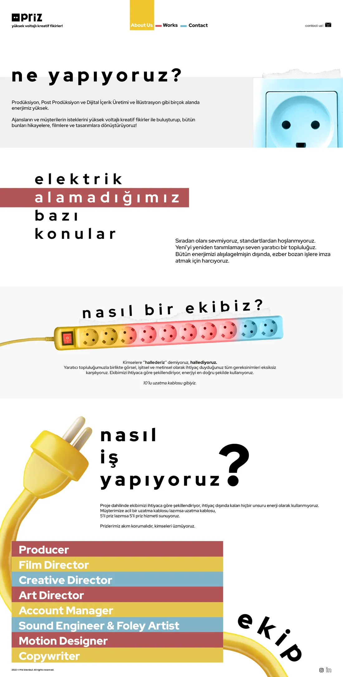
Production, post-production, digital content and illustration. We met agencies' and brands' briefs with high-voltage ideas and turned them into stories, films and designs.
Not wired for
The ordinary and the standard. We were a creative collective that liked redefining the new, and we put all our energy into work that broke the pattern.
How we worked
We shaped the team around each project and spent no energy we didn't need. A client who needed an extension cord got an extension cord; one who needed a five-way socket got that. Surge-protected, always.
Taşkesti glass bottle
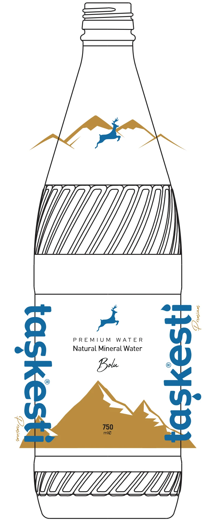
Packaging for Taşkesti, a natural mineral water from Bolu: a 750 ml glass bottle with the artwork printed straight onto the glass. The Bolu mountains wrap the body and the leaping deer sits on the shoulder. Drag to turn the bottle.
drag me
Drag to rotate
Role
Packaging design, print files
Format
750 ml glass, direct print
Colours
3
Year
2023
Print artwork on the bottle drawing: shoulder mark and front wrap.
The team, like a ten-way extension cord
Identities I drew
Logos and identity systems from the Priz years, from a sneaker store and a coffee bar to an insurance agency and a Web3 game studio.
Our own brand
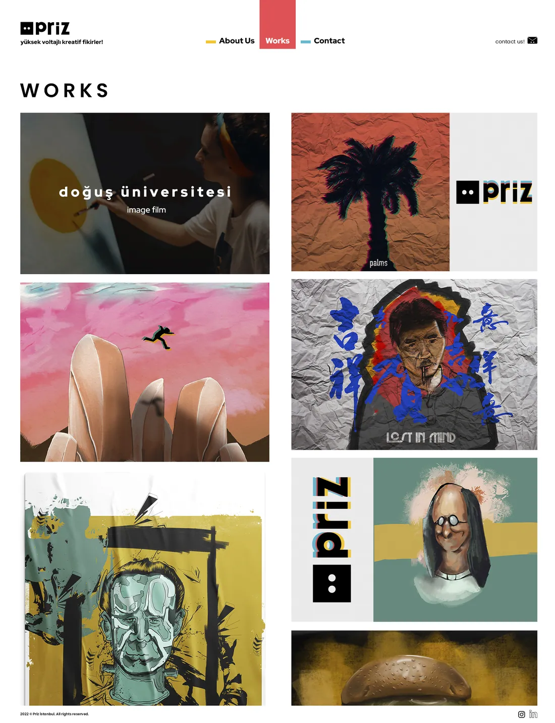
The Priz identity runs on a wall socket with two eyes and the three colours of a cable. I designed the mark, the website and our own channels.
Public service spots, university films, launch films and animation we produced at Priz. Each card plays a short preview; open it to watch the full film with sound.
# 04 · Now2024 — now
Currently working here
Senior Art Director
Inspinia Technology makes smart home and building automation systems. I lead how its products look and feel: the SkyThings mobile app, wall panels and room controllers, their simulators, and the internal tools the team works with every day.
Mobile app · iOS & Android · 2024–2026
SkyThings
The app people use to run their smart homes and buildings: lighting, climate, curtains and shutters, scenarios, cameras and security. I redesigned it from the ground up, from the first audit to the screens engineering shipped.
When I joined, SkyThings worked, but it looked and felt like every other app in the category. Even the biggest competitors shipped interfaces that were functional but dated, technically heavy and emotionally flat. The brief I set myself: make running a building feel modern, visual and simple.
02
The problem
The issue was bigger than one app. Smart home interfaces were built around technical functions instead of people. Controls were static and hard to read at a glance, and a light, a thermostat or a shutter never felt connected to what it actually did in the room.
03
How I started
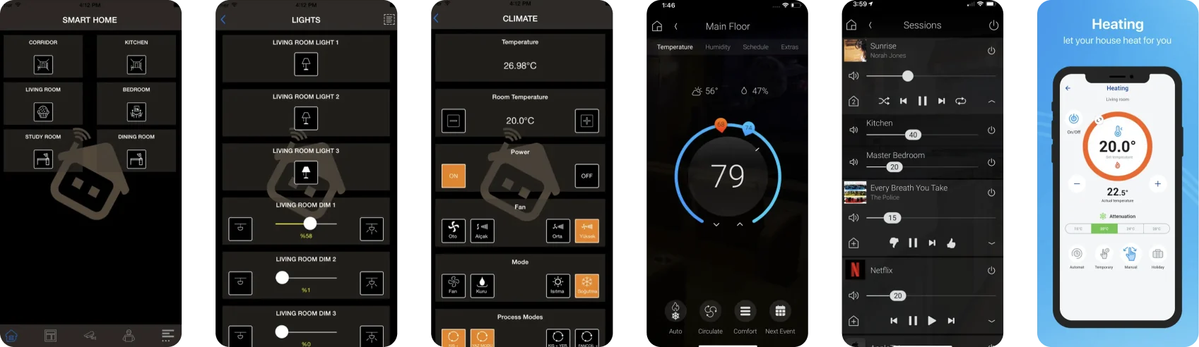
I collected screens from competitor apps, App Store previews, websites and wall panels and laid them side by side. The same patterns kept coming back: generic icons, static cards, almost no motion feedback, and control screens that read like engineering dashboards. That gap was the opportunity.
Competitor audit: control screens from six apps in the category.
04
Design direction
Every control should feel like the real action it stands for.
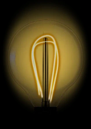
A light is a bulb whose filament warms as you slide. A thermostat is a dial from cool to warm. A shutter fills the screen with daylight as it opens. Each device card carries its live state on its face, so a room reads at a glance.
0%
LightThe filament warms up as you slide.ClimateA dial that runs from cool to warm.
0%
ShutterDaylight fills the screen as it opens.
05
Iterations
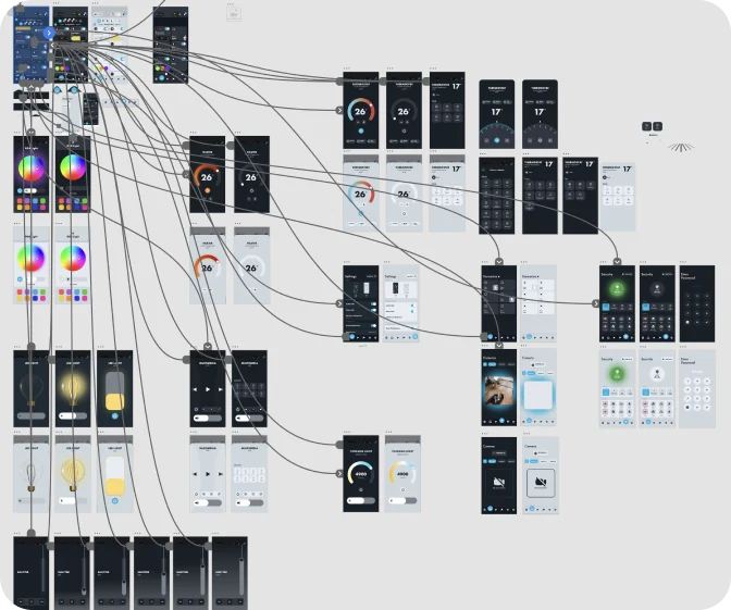
Several rounds of UI exploration, animation tests, icon studies and build reviews with engineering. I tried different control models, visual states and motion behaviours until usability, visual quality and technical feasibility met in one place.
Prototype map in Adobe XD.
06
The solution
What shipped:
Notification set
No internet connection
Device successfully connected
Location permission needed
Waiting for user approval…
Custom JSON animations
Curtain
Roller shutter
#Try the appScreens from the production Figma file
Tap through the real screens.
Pick a screen from the list or use the phone directly: drag the sliders and the dial, open a device, swipe a sheet down to close it.
07
Outcome
The redesigned SkyThings is live on iOS and Android. In 2026 the platform won the IoT Breakthrough Award for IoT Enterprise App Development Platform of the Year.
Concept · on site in Saudi Arabia · February 2026
Residence tablet
In February 2026 I worked on site in Saudi Arabia on a smart-community project and designed the tablet that hangs on every residence wall: home control, climate, lighting, security, community services and a voice assistant, in one calm interface.
Role
UI designer, on site
Platform
Wall tablet, 4:3
Status
Concept, not in production
Concept work. Client and brand names are hidden.
Hotel room controller · 2026
RINN
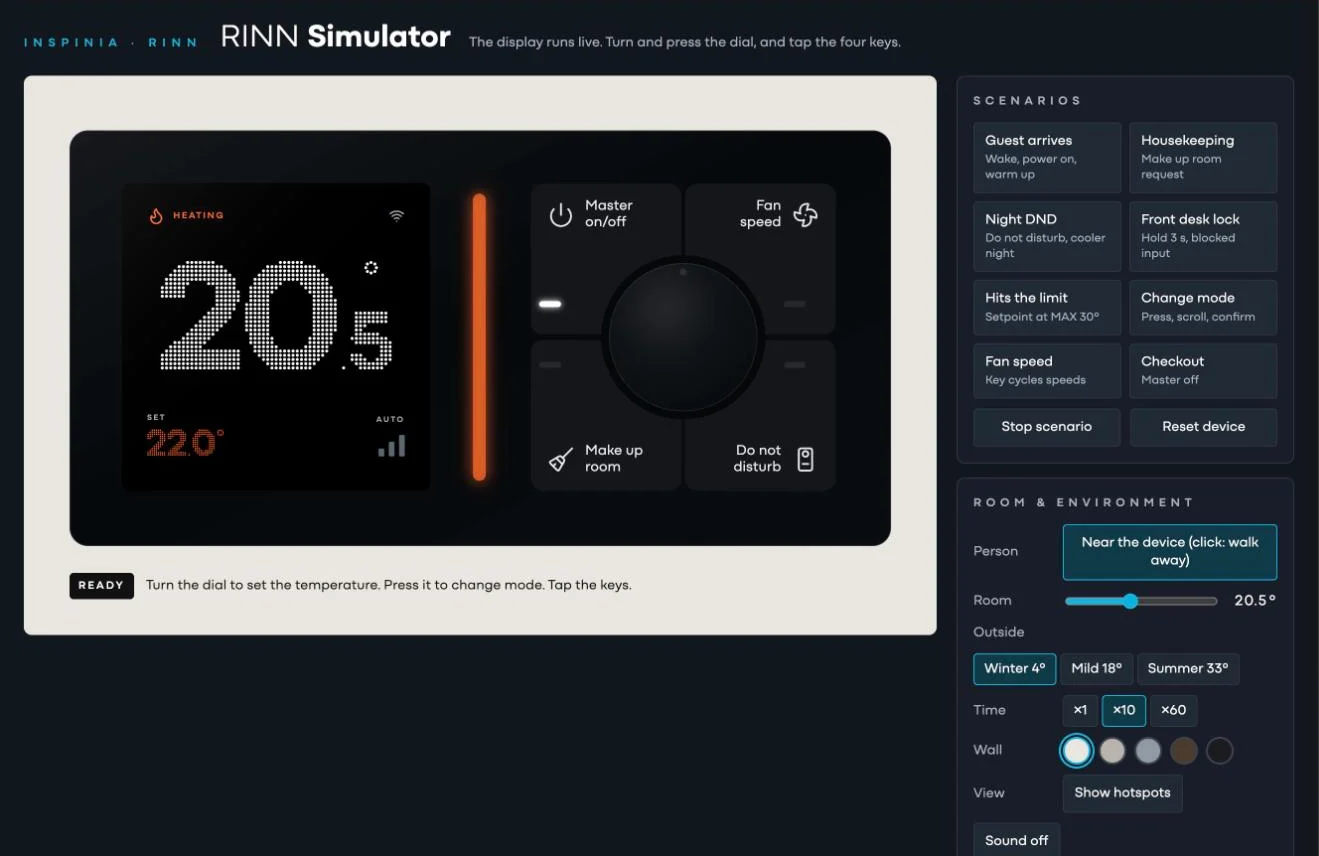
The interface for an upcoming hotel room controller: a dot-matrix temperature display, a dial and four keys for master power, fan speed, make up room and do not disturb. I built it as a live simulator, so the team could play through guest scenarios before the hardware existed.
Role
UI design and simulator
Scope
Display UI, key states, scenarios
Built with
Claude
Internal tools · 2026
AI tools
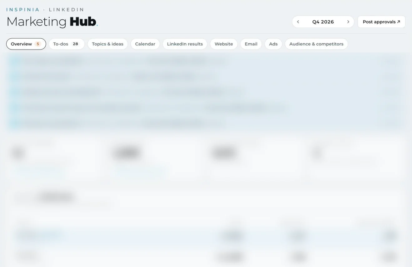
Since spring 2026 I have been designing and building Inspinia's internal tools with AI, from the first sketch to working software the marketing team uses every day.
Role
Design and build
Built with
Claude
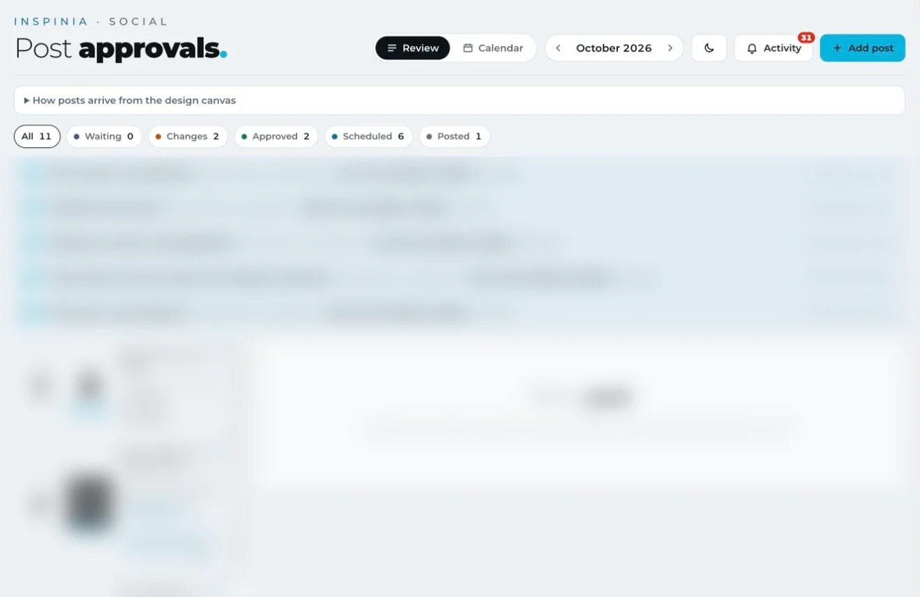
Post approvalsEvery LinkedIn post moves from the design canvas through review, changes and approval to a scheduled slot, with notes kept on each slide.Marketing HubQuarterly targets, to-dos, topics, the calendar, LinkedIn results, web, email, ads and competitors in one place.
Next in this tab3D product renders
# 05 · Own product2026
31 October · macOS
Lacefall
Lace for your Mac.
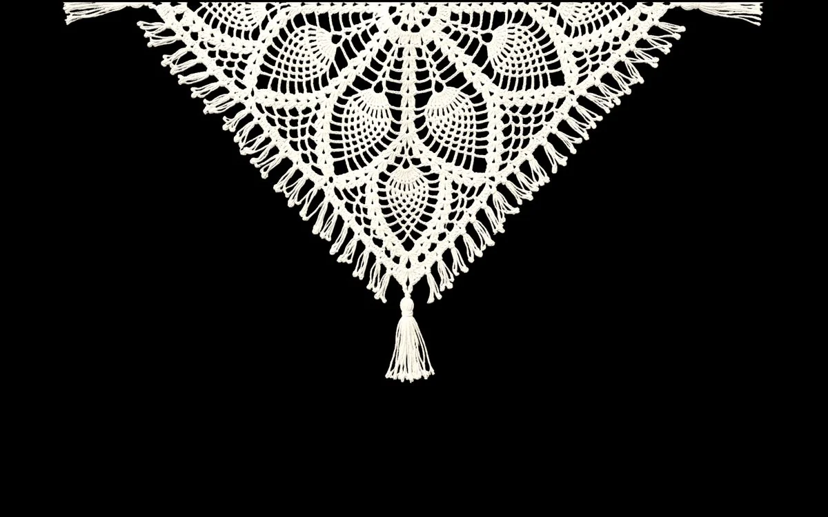
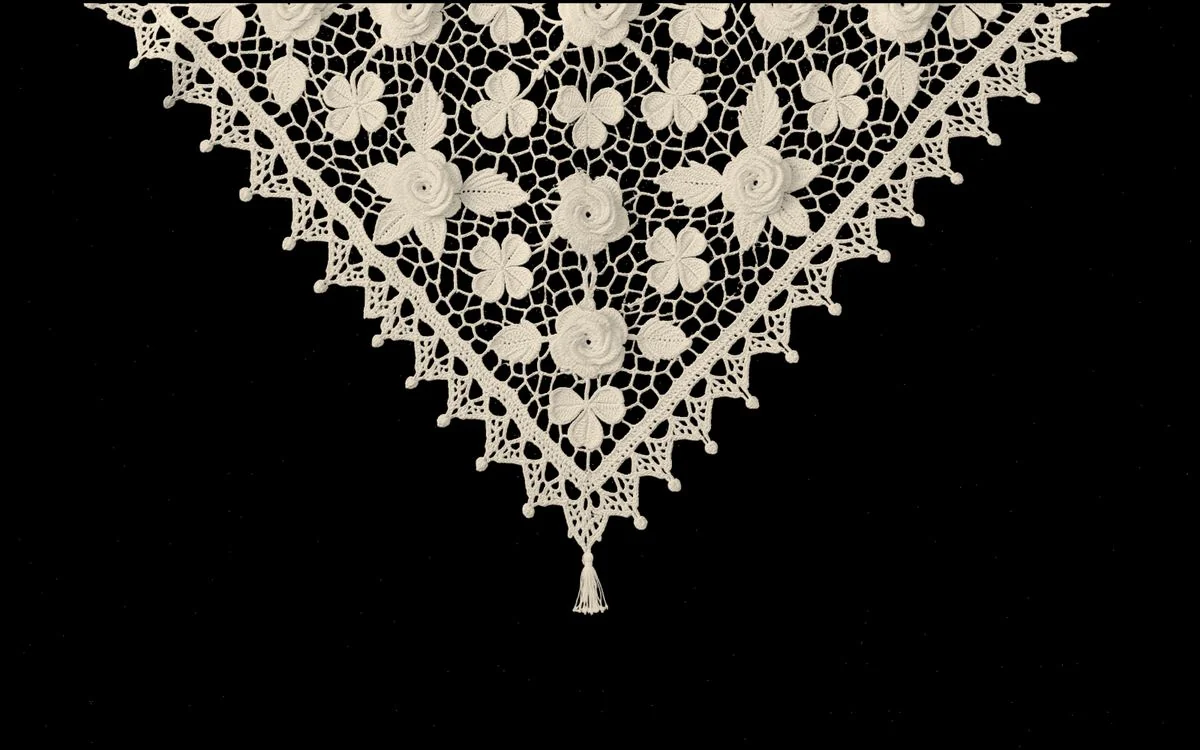
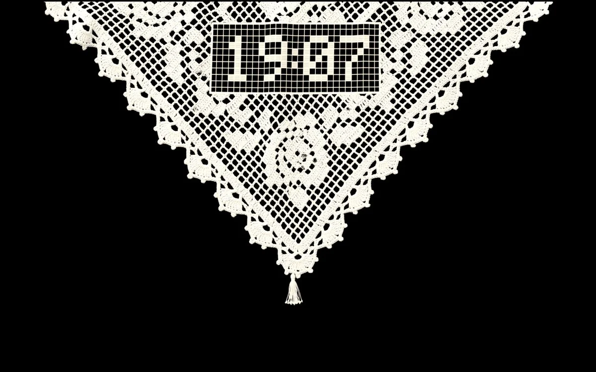
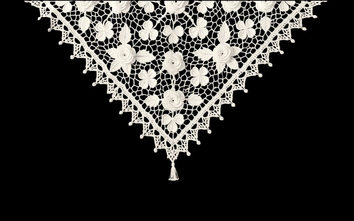
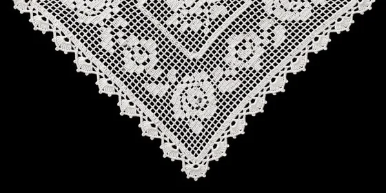
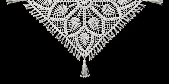
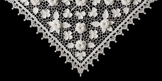
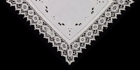
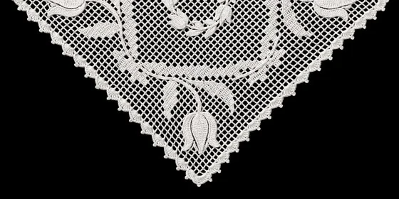
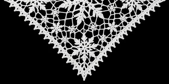
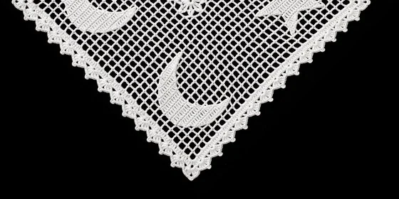
A macOS screen saver I designed and built on my own. Choose Lacefall in System Settings and, when the screen saver starts, a Turkish lace doily drops in from the top edge of the screen: it swings with the MacBook lid, gathers dust while you're away and tells the time. The idea comes from the crocheted cloth that sat on every television in Turkish homes.
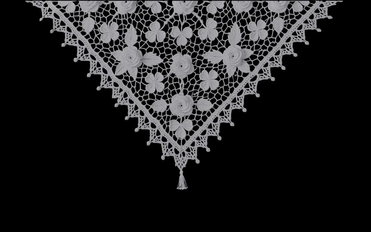
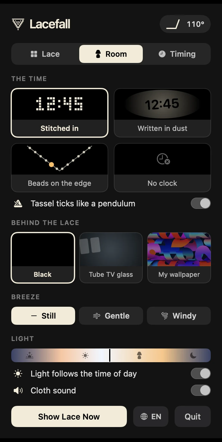
Tip the lid. The lace follows.It reads the MacBook's hinge sensor; the cloth swings forward as the lid closes, then settles.Dust settles while you're away.Leave the Mac alone and the lace slowly greys. A quick dip of the lid shakes it clean.It even tells the time.Stitched into the lace, written in the dust, or counted in beads along the edge.
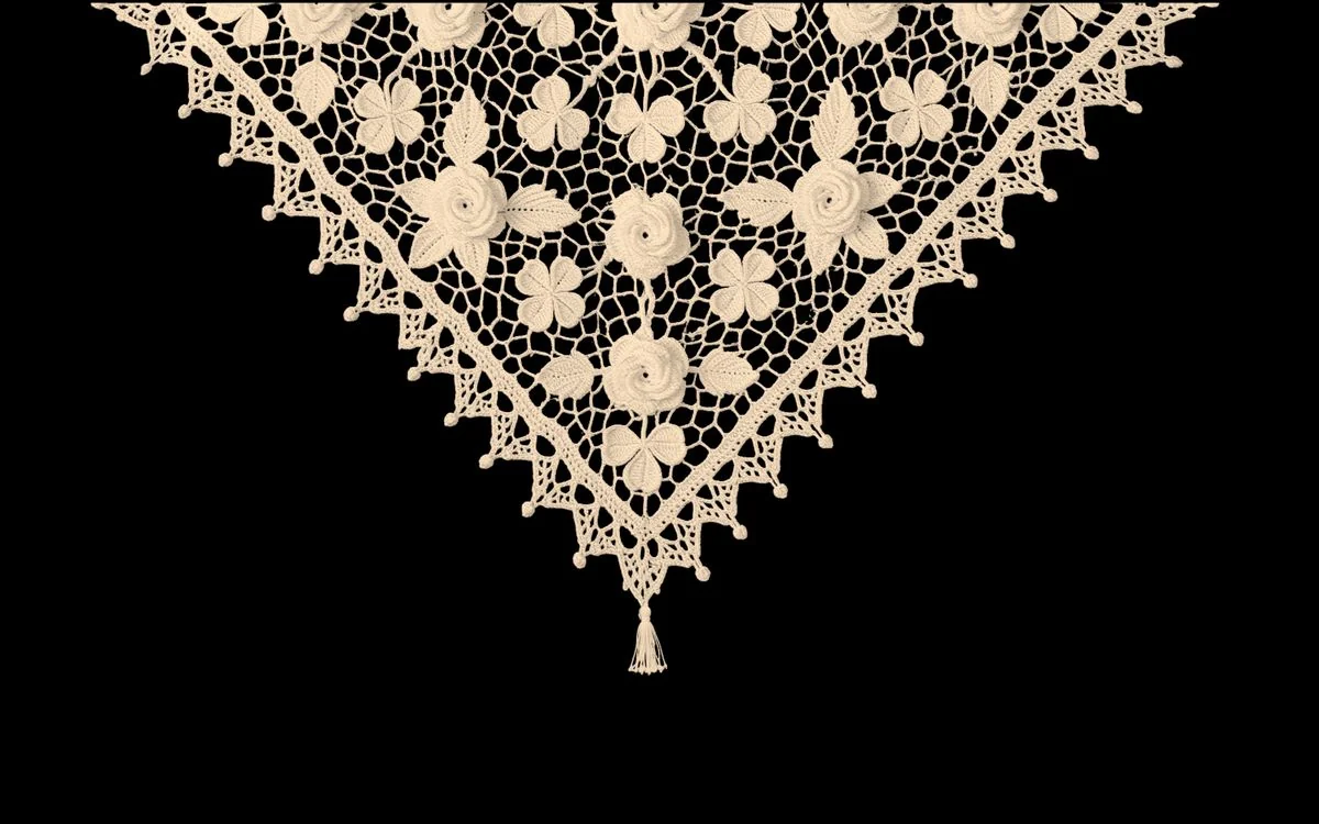
Light that follows the day
MorningEveningNight
Set up in a minute
Open LacefallA small lace icon appears in the menu bar. Click it for the settings panel.
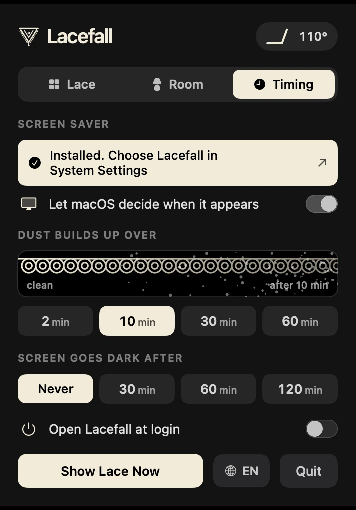
Make it your screen saverOne button in the Timing tab installs it and opens System Settings for you.
Choose it for each displayPick Lacefall under Screen Saver, display by display. When it starts, the lace drops in from the top edge and settles into place.
Settings you can see
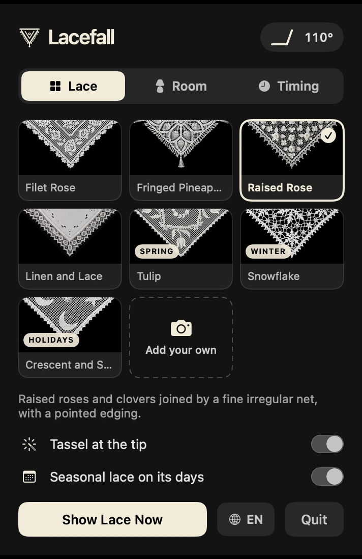
The settings live in a small menu bar panel, in English or Turkish. Three tabs, no jargon: every choice is drawn as what it does.
Seven cloths: four for every day, three for their seasons
Filet RoseFileli GülFringed PineapplePüsküllü AnanasRaised RoseKabartma GülLinen and LaceKeten ve DantelTulipLale · springSnowflakeKar Tanesi · winterCrescent and StarAy Yıldız · national days
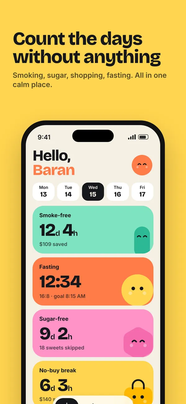
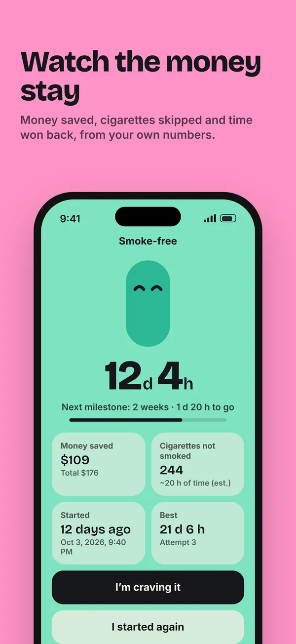
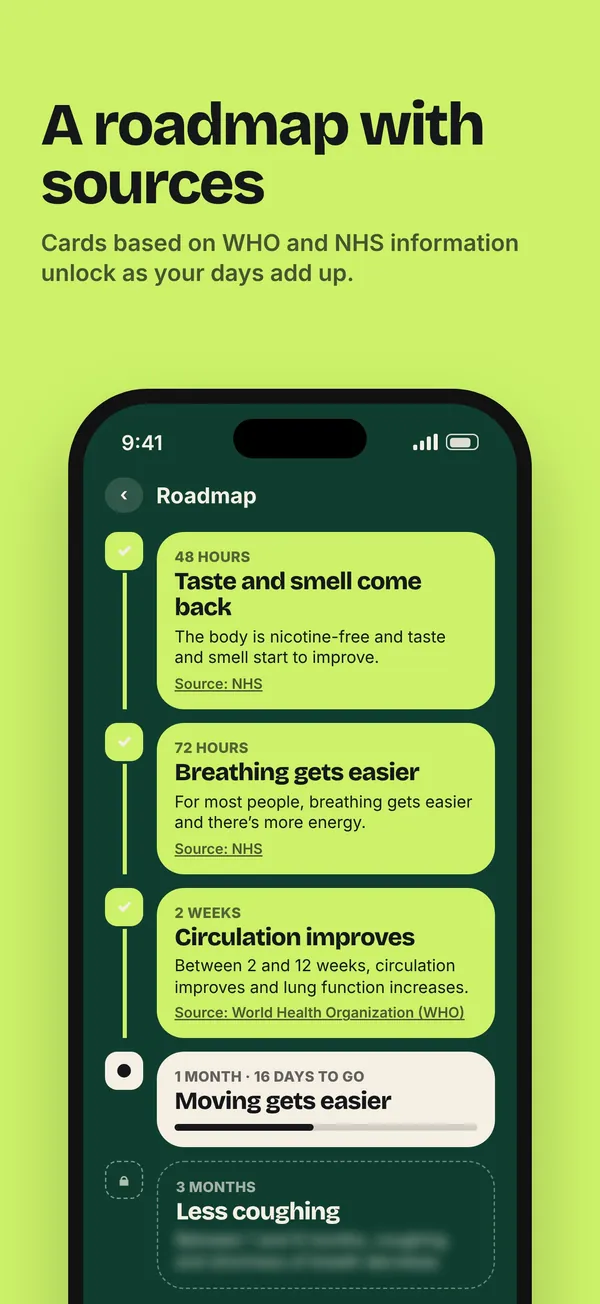
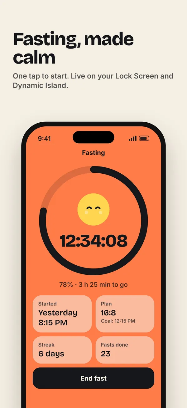
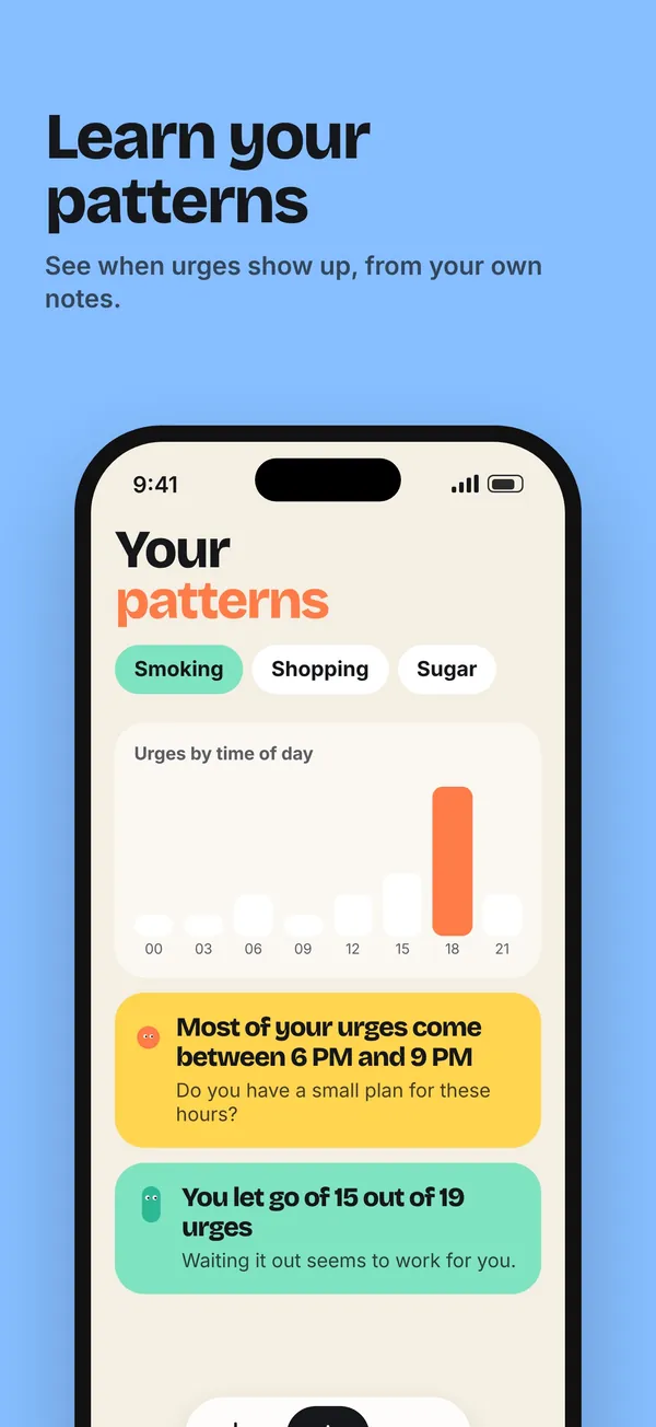
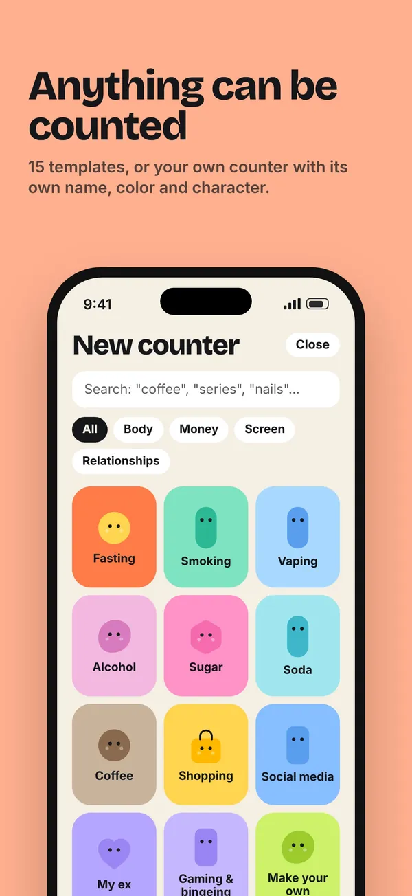
An iPhone app I designed and built on my own: a calm counter for the days you go without something. Smoking, sugar, shopping, scrolling or texting an ex, plus fasting, gym visits and unlimited counters you make yourself, by days, units, money or time. No streak shaming when you slip, no ads, no account; everything stays on the phone.
Role
Concept, product design, build, brand, site and launch
Platform
iPhone, with widgets and Live Activities
Business model
Free with one counter. Premium: $3.99 a month, $19.99 a year with a 7-day trial, or $39.99 once
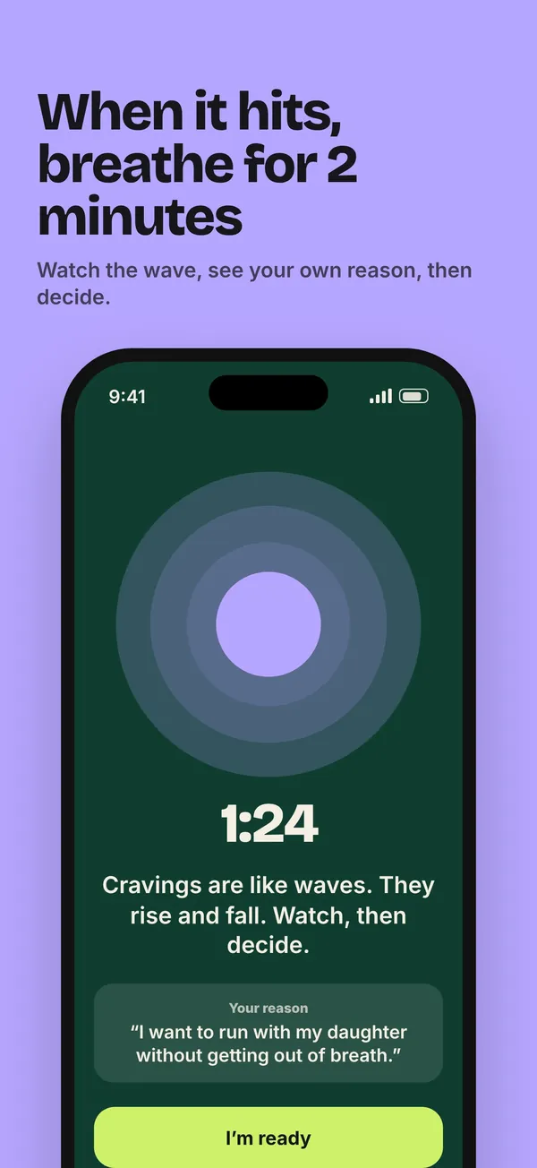
Seven screens from the App Store listing
Only on Notidy
Gym visits count themselvesPin your gym once; stay 15 minutes and the visit counts. Near a place you avoid, it offers a gentle 2-minute pause. No route tracking, no location history.
An alarm that knows you snoozedOn iOS 26 Notidy sets its own wake-up alarm. One tap on Snooze and that day starts over.
“I'm craving it”A 2-minute breathing pause from Siri, the Action Button or a widget, with your own recorded reason played back.
A savings jar and a 72-hour wait listMoney saved adds up toward a goal you name. Anything you want to buy waits three days first.
Messages that never sendWrite to your ex in a chat that looks real and goes nowhere. The urge passes, the message stays on the phone.
A time capsuleA letter to your future self that unlocks on day 7, 30, 90, 180 and 365.
No account, no server, no ads. Places, voice notes and unsent messages never leave the iPhone.
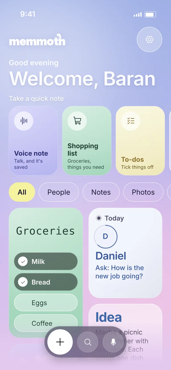
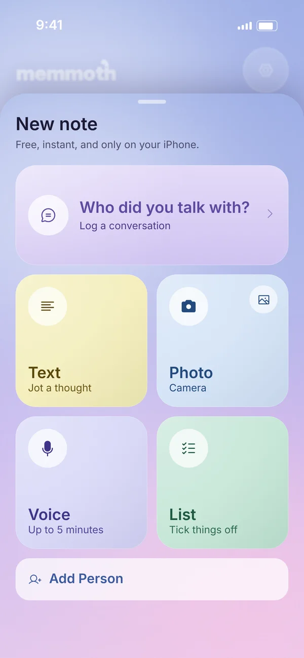
An iPhone app I designed and built on my own: a private notebook for the people you love. Write one sentence after you talk and Memmoth keeps the names, dates, allergies and gift ideas, then reminds you gently at the right moment. Quick notes in text, photo, voice or checklist are a tap away. No account, no ads; notes stay on the phone.
Role
Concept, product design, build, brand, site and launch
Platform
iPhone, with Home Screen and Lock Screen widgets
Business model
Free for up to 5 people. Premium: $2.99 a month, $19.99 a year with a 7-day trial, or $49.99 once
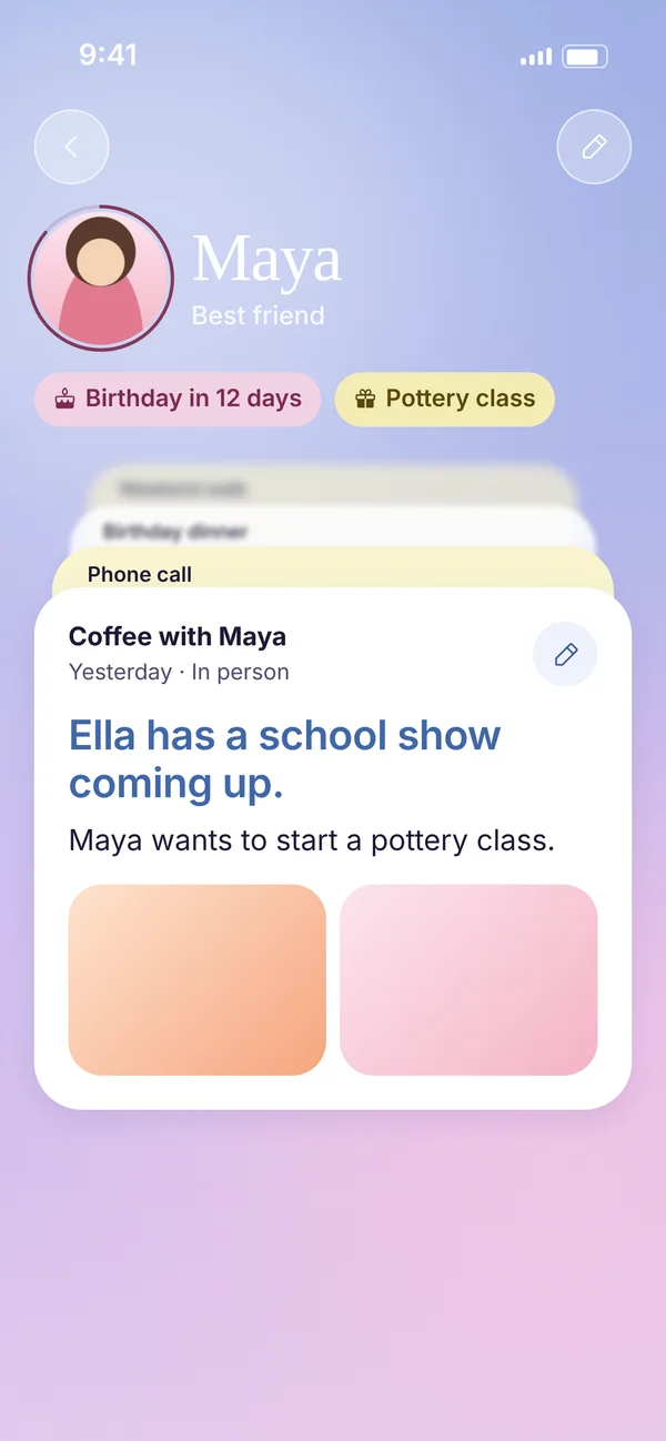
Allergy: PeanutsGift: Pottery classAsk: How did the show go? · Dec 13
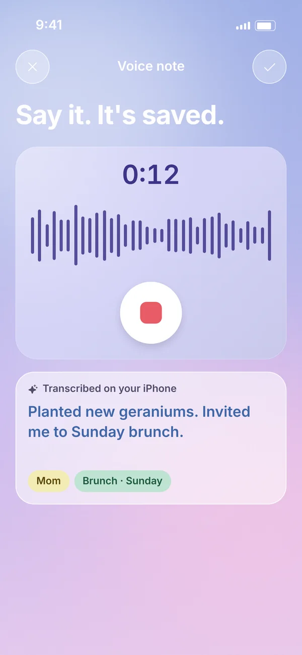
9:41
Voice note
Say it. It's saved.
0:12
Transcribed on your iPhone
Planted new geraniums. Invited me to Sunday brunch.
MomBrunch · Sunday
9:41
Good evening
Welcome, Baran
Take a quick note
Voice noteTalk, and it's saved
Shopping listGroceries, things you need
To-dosTick things off
TextWrite what's on your mind
PhotoSnap or pick one
Gift ideaFor someone you love
Who did you talk with?Log a conversation
Voice noteTalk, and it's saved
Shopping listGroceries, things you need
To-dosTick things off
TextWrite what's on your mind
PhotoSnap or pick one
Gift ideaFor someone you love
Who did you talk with?Log a conversation
AllPeopleNotesPhotosAudioListsGifts
Groceries
Milk
Bread
Eggs
Coffee
Wedding toast ideas · 0:47
Today
D
Daniel
Ask: How is the new job going?
Idea
Maybe a picnic this summer with everyone. Each brings one dish.
IdeaYesterday
Memmoth noticed something
Gift idea: Pottery classFor Maya · from your last note
9:41
What happened?
With Maya · In person · Today
Phone callHad coffeeTexted
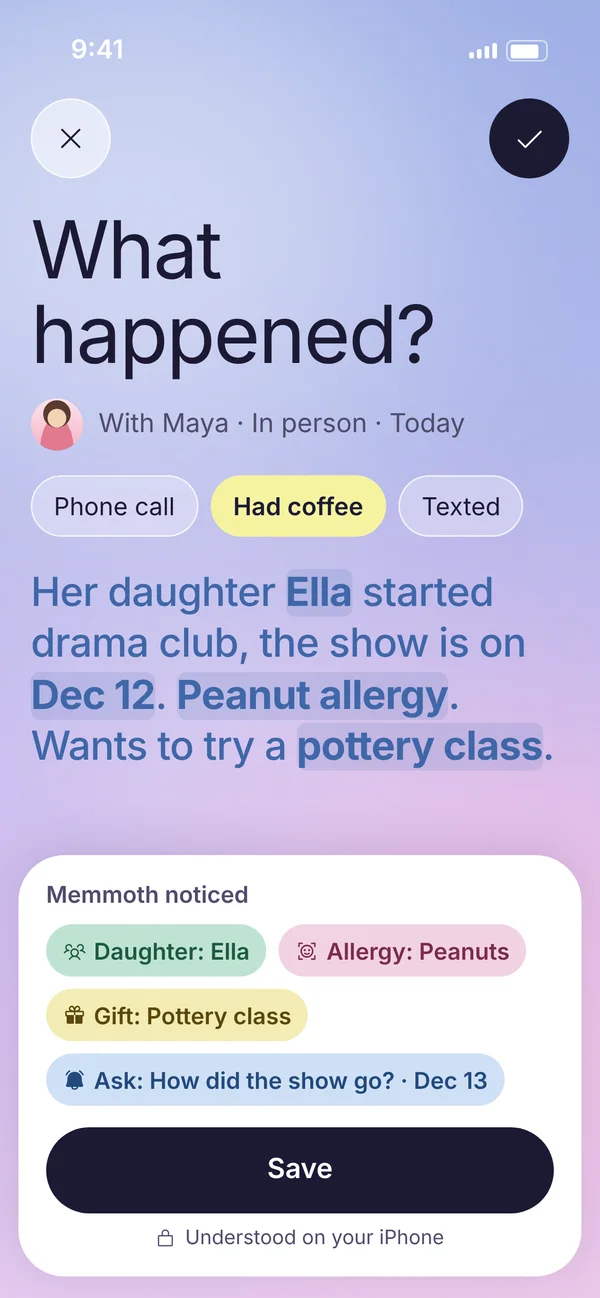
Her daughter Ella started drama club, the show is on Dec 12. Peanut allergy. Wants to try a pottery class.
Memmoth noticed
Daughter: EllaAllergy: PeanutsGift: Pottery classAsk: How did the show go? · Dec 13
Save
Understood on your iPhone
Alerji: FıstıkHediye: Seramik kursuSor: Gösteri nasıl geçti? · 13 Ara
9:41
Sesli not
Söyle, kaydolsun.
0:12
iPhone'unda yazıya döküldü
Yeni sardunyalar dikmiş. Pazar kahvaltısına çağırdı.
AnnemKahvaltı · Pazar
9:41
İyi akşamlar
Hoş geldin, Baran
Hızlıca not al
Sesli notKonuş, kaydolsun
Alışveriş listesiMarket, ihtiyaçlar
YapılacaklarTek tek işaretle
YazıAklındakini yaz
FotoğrafÇek ya da seç
Hediye fikriSevdiğin biri için
Kiminle konuştun?Bir görüşmeyi kaydet
Sesli notKonuş, kaydolsun
Alışveriş listesiMarket, ihtiyaçlar
YapılacaklarTek tek işaretle
YazıAklındakini yaz
FotoğrafÇek ya da seç
Hediye fikriSevdiğin biri için
Kiminle konuştun?Bir görüşmeyi kaydet
TümüKişilerNotlarFotoğraflarSesListelerHediyeler
Market
Süt
Ekmek
Yumurta
Kahve
Düğün konuşması fikirleri · 0:47
Bugün
D
Daniel
Sor: Yeni iş nasıl gidiyor?
Fikir
Bu yaz herkesle piknik. Herkes bir yemek getirsin.
FikirDün
Memmoth bir şey fark etti
Hediye fikri: Seramik kursuMaya için · son notundan
9:41
Ne oldu?
Maya ile · Yüz yüze · Bugün
Telefonda konuştukKahve içtikMesajlaştık
Kızı Ella tiyatroya başlamış, gösterisi 12 Aralık'ta. Fıstık alerjisi var. Seramik kursuna gitmek istiyor.
Memmoth şunları fark etti
Kızı: EllaAlerji: FıstıkHediye: Seramik kursuSor: Gösteri nasıl geçti? · 13 Ara
Kaydet
iPhone'unda anlaşıldı
Six screens from the app
Only on Memmoth
One sentence, sortedType or dictate what happened. Names, dates, allergies, gift ideas and questions for next time are picked out on the iPhone, and nothing is saved until you approve it.
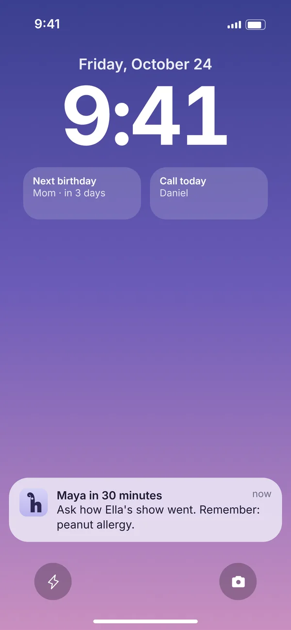
Ready before you meetMemmoth reads your calendar on the iPhone, never changes it, and sends a short prep note 30 minutes before you see someone.
Gift memoryGift ideas wait next to each person and show up in the reminder when a birthday gets close.
Closeness ringsSee at a glance who you have been in touch with and who you have been missing, with gentle nudges at your own rhythm.
Quick captureVoice, photo, checklist or text notes in one tap, right from the Home Screen.
Locked when you wantAn optional Face ID lock, free for everyone, and a one-file export of everything whenever you like.
No account, no ads, no tracking. Notes stay on the iPhone and in its own backup.
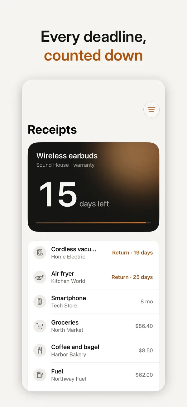
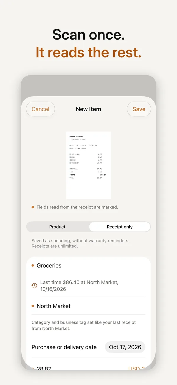
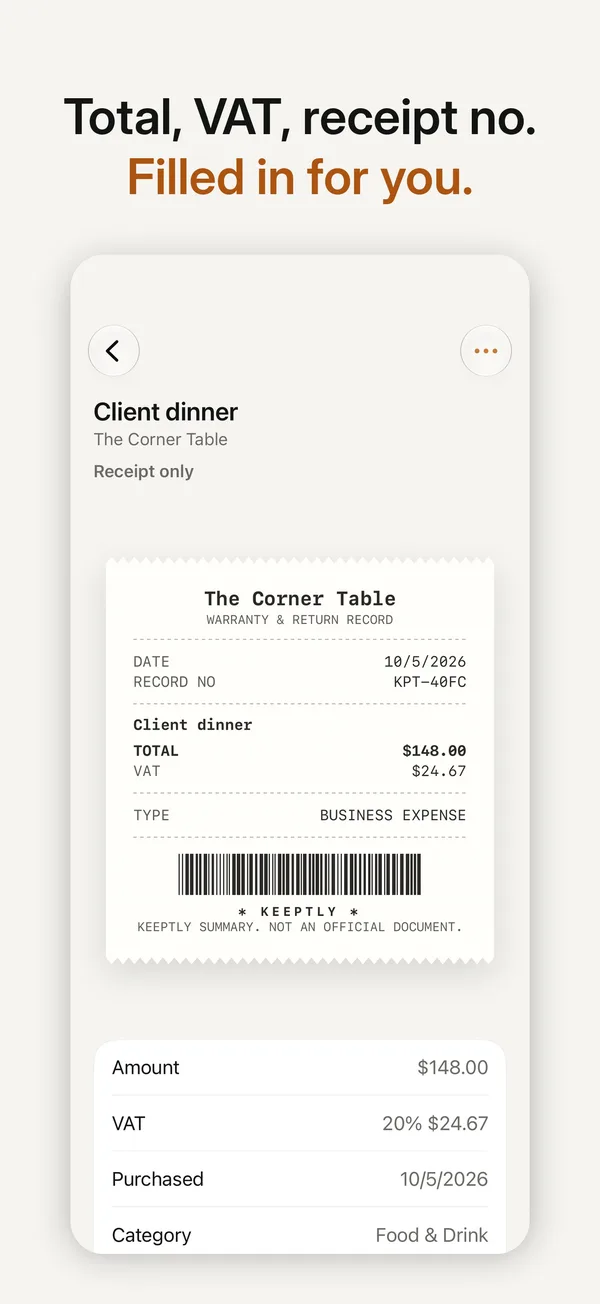
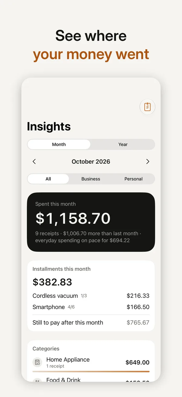
An iPhone app I designed and built on my own: scan a receipt once and Keeptly reads it, counts down your return and warranty windows, adds up your month and packs everything for your accountant. Text recognition runs on the iPhone. No account, no ads.
Role
Concept, product design, build, brand, site and launch
Platform
iPhone, with Home Screen widgets and Siri shortcuts
Business model
Scanning is free, with up to 10 products tracked. Premium: $2.99 a month, $14.99 a year with a 7-day trial, or $29.99 once
Six screens from the App Store listing
Only on Keeptly
Return radarEverything you can still take back, sorted by the days left, with the amount at stake.
Warranty countdownReminders 30, 7 and 1 day before a warranty ends, free for everyone.
Claim packetOne PDF with the receipt, product details and serial number, ready for the store.
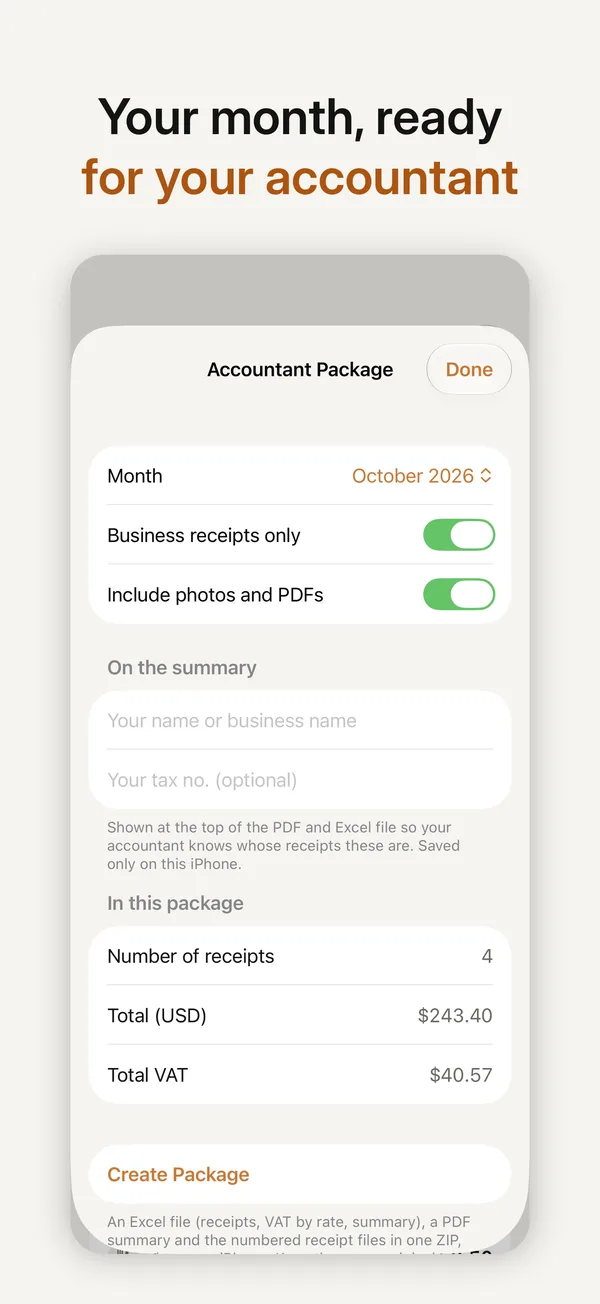
Accountant packageOne ZIP a month: an Excel workbook with VAT per rate, a PDF summary and the original receipts numbered to match.
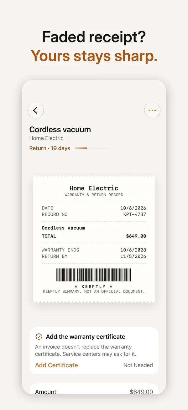
Faded receipt rescueThermal paper fades. Keeptly keeps a sharpened copy and a clean digital receipt.
Price memoryWhat you paid for the same thing last time, right where you need it.
No account, no Keeptly server, no ads, no tracking. Receipts stay on the iPhone.
Every post on this site on one canvas, grouped by brand. Drag to move around, pinch or use the buttons to zoom, and click a post to open it.
Drag to explore
# 10 · About
About
Twelve years on both sides of the table: agency and product.
that's me
Baran
I'm Baran, a senior art director based in Istanbul. I started in print and illustration, co-founded my own agency, Priz Istanbul, and now lead design for smart building and IoT products at Inspinia Technology. I like work where the interface, the brand and the motion are one decision, and I build more and more of my own tools with AI.
What I do
Career
Education
#Contact
Start a project
contact@baranborak.com
Write an emailArt direction, brand and campaign work, product design and tools built with AI. Write a few lines about what you are making and when you need it.
I use analytics and ad measurement cookies to understand which work people look at and whether my ads reach the right people. Nothing loads until you agree. Privacy
 0
 0%
 Lacefall
 Notidy

 Memmoth
 Keeptly