Art direction, brand and campaign design, product and UX design, mobile apps, design systems, smart building and IoT, motion and AI workflows.
2014 — 2026
Scroll to open
Senior Art DirectorBaran
Baran BORAK
contact@baranborak.com Istanbul · --:--
Scroll to open the folder
#Statement
0years in design
0brands served
0posts in the archive below
0IoT Breakthrough Award, 2026
#Contents5 chapters
Contents
# 01 · Now2024 — now
Currently working here
Inspinia
Senior Art Director
Inspinia Technology builds smart home and building automation systems. I design its mobile apps, wall panels and simulators, and the internal tools the team runs on.
Mobile app · iOS & Android · 2024–2026
SkyThings
A mobile app that controls smart homes and buildings: lighting, climate, curtains and shutters, scenes, cameras and security. I redesigned it from the ground up.
IoT Breakthrough Awards 2026IoT Enterprise App Development Platform of the Year
When I joined, SkyThings worked, but it looked and felt like the rest of the category. Even the biggest competitors were shipping interfaces that were functional, visually dated, technically complex and emotionally flat. My brief to myself was to make controlling a building feel modern, visual and simple.
02
The problem
The issue was bigger than one app. Smart home interfaces were built around technical functions instead of people. Controls were static and hard to read at a glance, and a light, a thermostat or a shutter never felt connected to the real action it stood for.
03
How I started
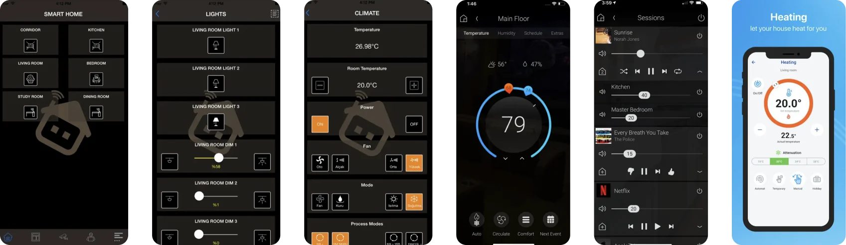
I collected screens from competitor apps, App Store previews, websites and wall panels and laid them side by side. The same patterns kept appearing: generic icons, static cards, almost no motion feedback, and control screens that read like engineering dashboards. That gap became the opportunity.
Competitor audit: control screens from six apps in the category.
04
Design direction
Every control should feel like the real action it represents.
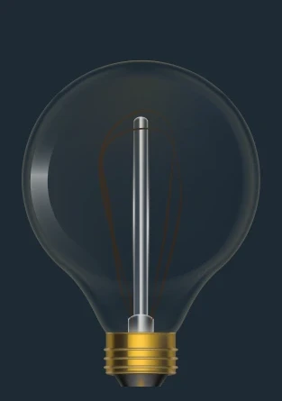
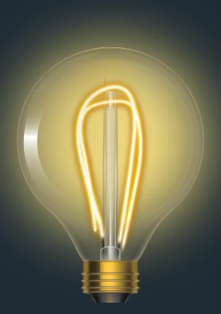
A light is a bulb whose filament warms as you slide. A thermostat is a dial from cool to warm. A shutter fills the screen with daylight as it opens. Each device card carries its live state on its face, so the room reads at a glance.
0%
LightThe filament warms up as you slide.ClimateA dial that runs from cool to warm.
0%
ShutterDaylight fills the screen as it opens.
05
Iterations
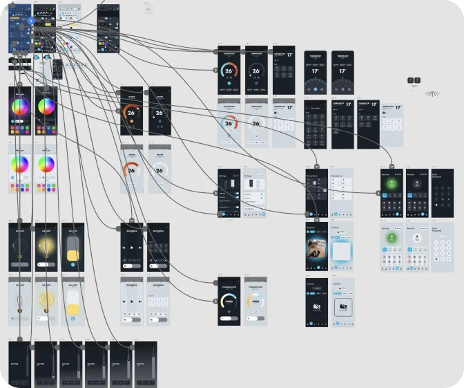
I went through several rounds of UI exploration, animation tests, icon studies and implementation checks with engineering, trying different control models, visual states and motion behaviours until usability, visual quality and technical feasibility met.
Prototype map in Adobe XD.
06
The solution
What shipped:
Notification set
No internet connection
Device successfully connected
Location permission needed
Waiting for user approval…
Custom JSON animations
Curtain
Roller shutter
#Try the appScreens from the production Figma file
Tap through the real screens.
Pick a screen or use the phone directly. Drag the sliders and the dial, open a device, swipe a sheet down to close it.
07
Outcome
The redesigned SkyThings ships on iOS and Android, and in 2026 the platform won the IoT Breakthrough Award for IoT Enterprise App Development Platform of the Year.
Concept · on site in Saudi Arabia · February 2026
Residence tablet
I worked on site in Saudi Arabia on an internal smart-community project and designed the tablet that sits on every residence wall: home control, climate, lighting, security, community services and a voice assistant.
Role
UI designer, on site
Platform
Wall tablet, 4:3
Status
Concept, not in production
Concept work. Client and brand names are hidden.
Hotel room controller · 2026
RINN
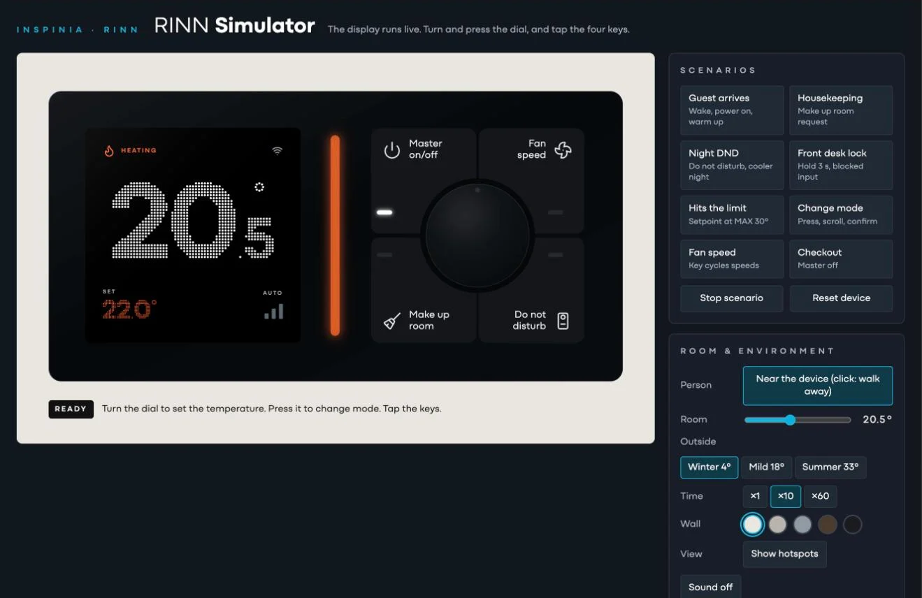
The interface for an upcoming hotel room controller: a dot-matrix temperature display, a dial and four keys for master power, fan speed, make up room and do not disturb. I built it as a live simulator, so the team can play through guest scenarios before the hardware exists.
Role
UI design and simulator
Scope
Display UI, key states, scenarios
Built with
Claude
Internal tools · 2026
AI tools
Over the last six months I have been designing and building Inspinia's internal tools with AI, from the first sketch to a working product the team uses every day.
Role
Design and build
Built with
Claude
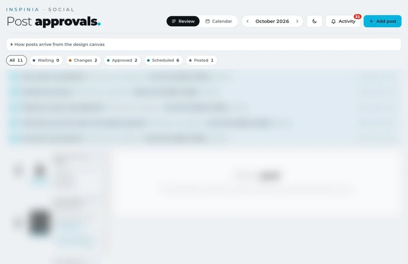
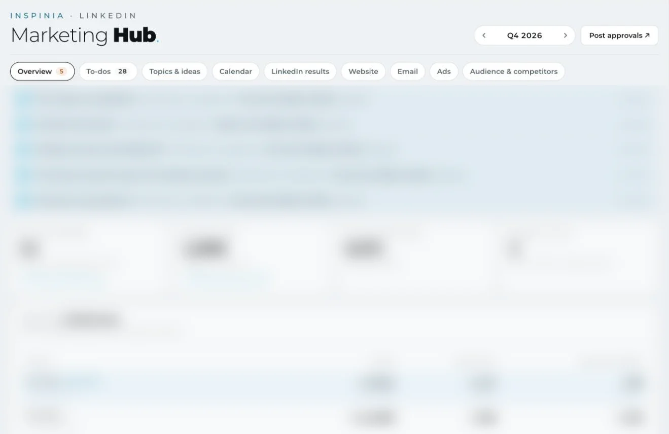
Post approvalsEvery LinkedIn post moves from the design canvas through review, changes and approval to a scheduled slot, with notes kept on each slide.Marketing HubQuarterly targets, to-dos, topics, calendar, LinkedIn results, web, email, ads and competitors in one place.
Next in this tab3D product renders
# 02 · My agency2021 — 2023 · Istanbul
High-voltagecreative ideas.
Co-founder & Senior Art Director
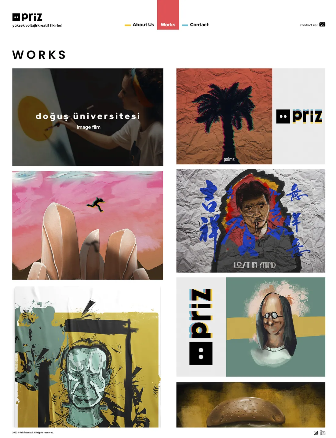
I co-founded Priz Istanbul and ran it for two years: a small studio for production, post-production, digital content and illustration. We wrote the campaigns, drew the identities, shot the films and ran the social channels for more than thirty brands.
0
brands
0
posts and stories
0
identities
0
films
What we do
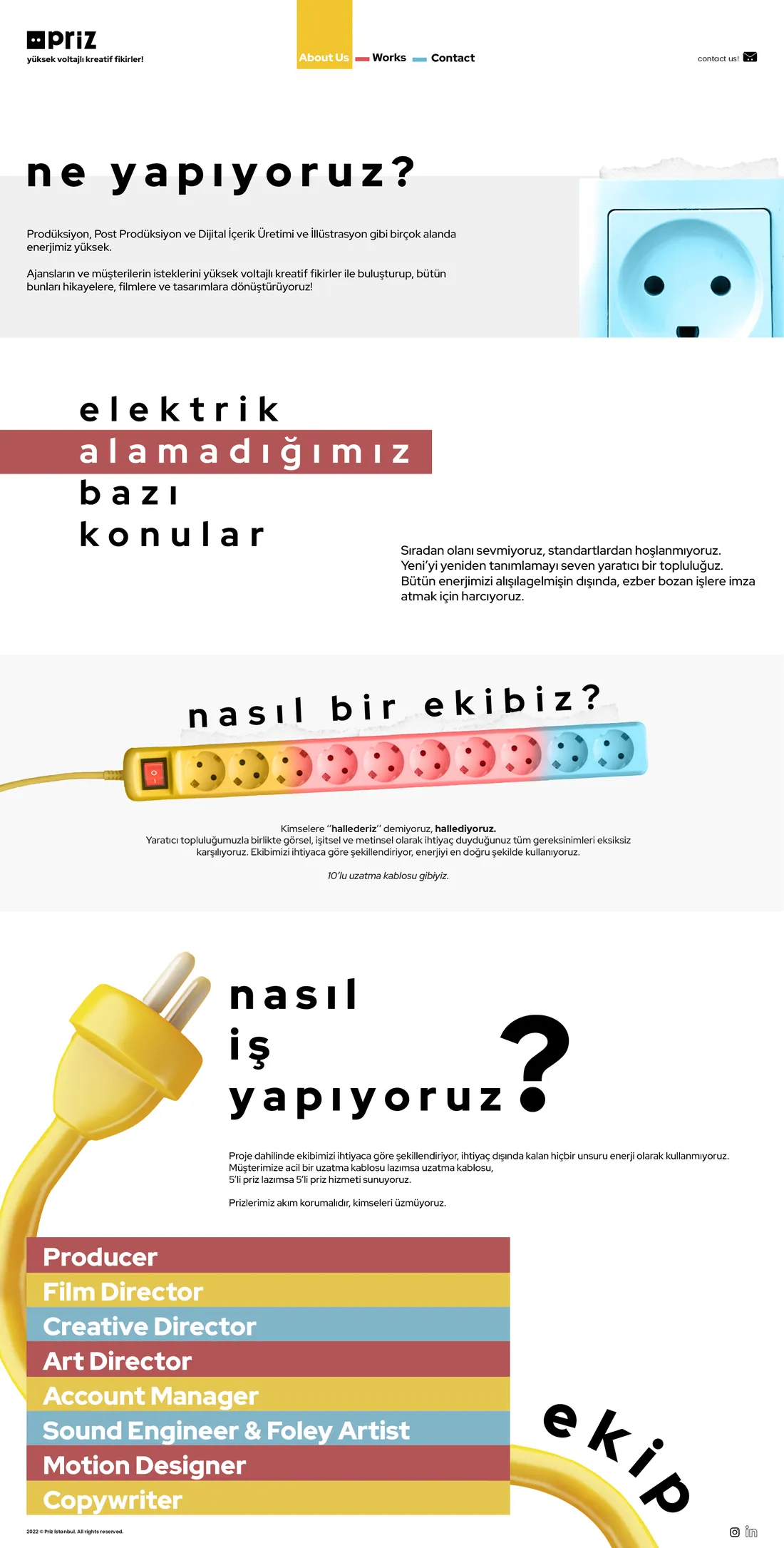
Production, post-production, digital content and illustration. We meet agencies' and clients' briefs with high-voltage ideas and turn them into stories, films and designs.
Not wired for
We don't like the ordinary or the standard. We are a creative collective that likes redefining the new, and we spend all our energy on work that breaks the pattern.
How we work
We shape the team to each project and use no energy we don't need. If a client needs an extension cord, they get an extension cord; if they need a five-way socket, they get that. Surge-protected, always.
Taşkesti glass bottle
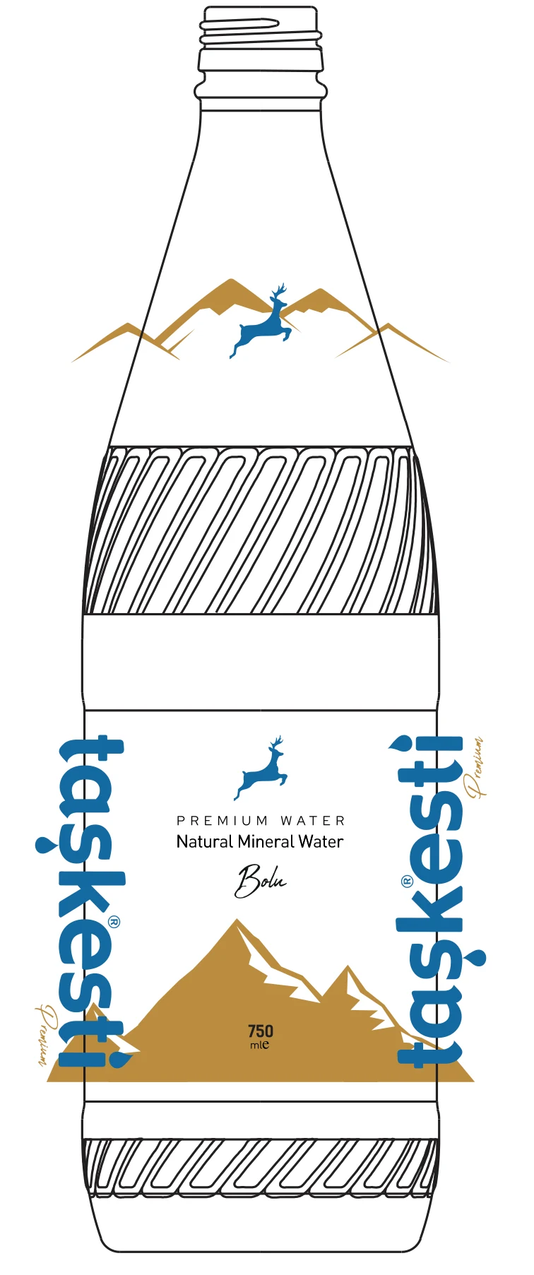
Packaging for Taşkesti, a natural mineral water from Bolu: a 750 ml glass bottle printed straight onto the glass. The Bolu mountains wrap the body and the leaping deer sits on the shoulder. Drag to turn the bottle.
Drag to rotate
Role
Packaging design, print files
Format
750 ml glass, direct print
Colours
3
Year
2023
Print artwork on the bottle drawing: shoulder mark and front wrap.
The team, like a ten-way extension cord
Identities I drew
Logos and identity systems from Priz, from a sneaker store and a coffee bar to an insurance agency and a Web3 game studio.
Our own brand
The Priz identity runs on a socket with two eyes and the three colours of a cable. I designed the mark, the website and our own channels.
Campaigns, identities and social systems I art directed between 2019 and 2024, most of them at my agency Priz Istanbul. Open any brand to see the posts as they ran.
# 03 · Films & motion1920 × 1080
Films
Public service spots, university films, launch films and animation we produced at Priz. Each card plays a short cut.
# 04 · Archive · canvas
Archive
Every post on this site on one canvas, grouped by brand. Drag to move around, pinch or use the buttons to zoom, click a post to open it.
Drag to explore
# 05 · About
About
Twelve years, two sides of the table: agency and product.
I'm Baran, a senior art director in Istanbul. I started in print and illustration, co-founded my own agency, Priz Istanbul, and now lead design for smart building and IoT products at Inspinia Technology. I like work where the interface, the brand and the motion are one decision.
Career
What I do
Education
#Contact
Start a project
contact@baranborak.com
Write an emailArt direction, product design and AI tooling. Write a few lines about what you're building.
I use analytics and ad measurement cookies to understand which work people look at and whether my ads reach the right people. Nothing loads until you agree. Privacy
 0%
0%